Features and extensions in all versions
There are extensions and improvements in the architectural elements section of the new version. But pCon.planner 6.5 also brings you new features such as blinds, overhead doors, sloping or grid ceilings, all of which increase the program’s usefulness for a range of applications and design spaces.
Extensions to existing elements
|
While we were reviewing the features that could be configured we grouped the set of (previously individual) objects Door, Glass Door, Double Door and Double Glass Door together. We did the same with Windows, Sliding Doors and Glass Fronts or Panels. |
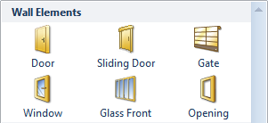
Windows and Doors
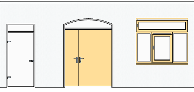
Once a wall element has been created, its properties can be edited using Property Editor. In the following illustrations the Orthographic projection is used to show the various options available for doors and windows.
|
||
Simple door with block frame, fully-glazed door panel, rectangular top light, threshold and no. 1 of the five possible handles. |
Double doors in frame, solid door panels of different sizes, arched top light and no. 1 of the five possible handles. |
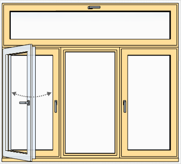
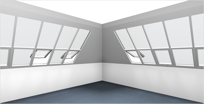
Window made up of two fixed segments and one that will open plus a rectangular top light. In the illustration the top light and the middle segment have been tilted open. |
|
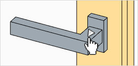
Besides having so many variable properties, doors, windows and sliding doors are provided with interactors at the height of the door handle or opening lever and these interactors will “open or close” the door or window in a smooth operation – see illustration on left. The lower graphic is a close-up of a window interactor. |
|
Glass fronts
The glass fronts have also had their properties and editing options extended. Besides deciding on Thickness and Depth for the crossbars and jambs you can set the Frame and Centre Offset for the whole object. In addition, the horizontal and vertical struts can be moved or deleted interactively by clicking on them. Drawing additional crossbars or verticals is also simple and interactive now. When the glass front has been selected, red dotted lines will appear near the mouse position in the areas between existing verticals or bars: clicking these will turn them into the desired feature.
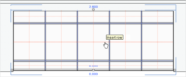
Update function for floors and ceilings
Changing walls often means that time-consuming changes have to be made to get the floors and ceilings to fit the new architecture. To speed up this step, an update function has been developed for the new pCon.planner. Here is a graphic to show how a floor can now be adapted to fit a newly changed space between walls.
|
|||
The floor is selected. Clicking on the hammer symbol starts the update function. |
The mouse is rolled over the space to which the floor must be adapted – a red frame is generated. |
The next mouse click reduces the floor to the new dimensions. |
The other floor area can be adapted in the same way. |
The advantage of the update function is not only that it is no longer necessary to re-create the floor and ceiling each time but also that the rotation and scaling of any textures are preserved. It is also possible to assign the floor to another, different space once it has been selected and the hammer symbol has been clicked on. And it is no problem to copy a floor and adapt it to the shape of the new room using the update function.
Improved stairs tool
|
There has been a thorough rework of the stairs tool for version 6.5. Now, in contrast to the old method, the user can give each Staircase a specific height, and it is no longer necessary to bother about setting height and length of the steps. You just have to state how many steps there should be. After that the program will compute the best-fitting step height and length, and assign these to the staircase. |
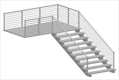
The Handrails function has been extended so that now there is a choice between two types of handrail; also, the front of the landing alongside the top of the stairs can be enclosed.
New architectural objects
In pCon.planner 6.5 there are four new architectural objects that can be created: these are rolling or sectional doors, indoor and outdoor blinds, a grid ceiling into which lights can be fitted, and sloping ceilings which can have wall elements added.
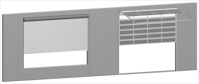
Overhead rolling and sectional doors
As in the case of doors, windows and glass fronts, there are overhead doors to be found as wall elements on the Insert tab in the Room group. After a click on the symbol it is possible to place an overhead door into any wall with a further click of the mouse. Then there are a number of properties that can be configured.
•Height, Width, Parapet
•Opening Height: This is where to set how high the opening made by the door is to be
•Type: the options are Sectional Door and Rolling Door
•Row Count/Column Count (for sectional overhead doors)
•Frame Thickness (for sectional option)
•Door Track Type (for sectional option)
There is the possibility when designing sectional overhead doors to give the different segments different materials or colors.
|
Rollover and sectional overhead doors, front view, projected orthogonally. Not only the opening height but also the individual colors and materials of segments for sectional overhead doors can be separately assigned. |
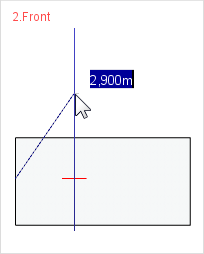
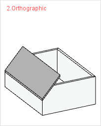
Sloping Ceilings
|
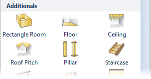
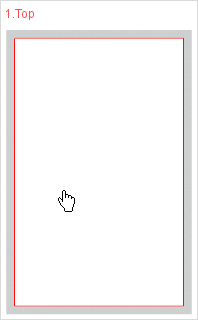
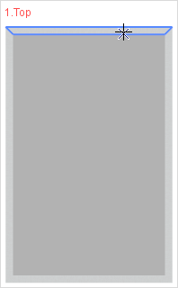
The tool for creating sloping ceilings is in the Room group on the Insert tab, under Addtionals. Clicking on the icon allows you to start drawing. Basically, it is wise to stick to 2D projections such as Top, Front and Orthographic. |
|
|
|
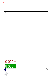
Establish the height of the knee wall below the sloping ceiling. |
Establish the area to be covered. |
Set the height of the knee wall. |
|
|
|
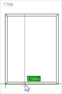
Set the height of the sloping part. |
If the slope cuts through walls, these will be shortened appropriately. |
The procedure is similar for setting the height of the wall. |
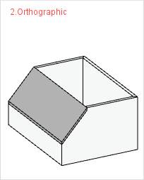
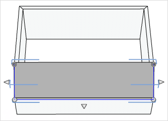
There are three interactors to use in adapting sloping ceilings. |
|
|
|
For shortening or lengthening the upper edge or turning the slope in relation to the dividing line. |
|
|
For rotating, lengthening or shortening the entire sloping section. |
|
|
For setting the lateral overhang and any overhang (eaves) over the dividing line. |
|
Sloping ceilings can be fitted with windows and glass fronts. When positioning these or aligning them, it is important to note that the interactors have different functions than they do for windows or glass fronts inserted into a wall. The following example illustrates the many ways in which sloping ceilings can be used.
Blinds
Like the sloping ceilings tool, the tool to create blinds is also under Additionals in the Room group menu on the Insert tab. Blinds can, for example, be placed in front of windows or glass fronts, and pCon.planner will support the user in positioning them. When the tool has been started, a click will select the edge of the window or glass front on which the blind is to be created. The Property Editor allows various features to be configured, for example whether the blinds are to be internal or external or how far and at what angle the strips are to be opened.
|
|
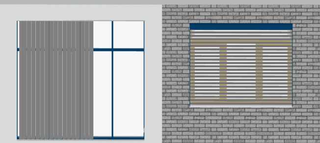
Vertical interior blind in front of a glass front. There is an interactor to set the side from which the blind can be opened. |
Exterior blind in front of a window. |
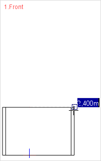
Grid ceiling
The grid ceiling offers an extension to the standard ceiling, providing new options for configuring indoor space, as this architectural element is a means of positioning lighting elements within the ceiling grid.
|
|
|
Establish wheater the grid to be created is for an external or internal ceiling (here it is internal). |
Select any wall in the design, which will serve to set the alignment of the ceiling grid. |
Set the height of the ceiling. The next thing is to establish its thickness. |
|
|
|
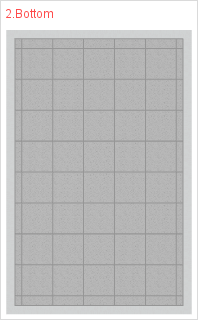
In the Property Editor, change the Type from Normal to Grid and the grid will become visible. The size of the segments in this grid can be configured. |
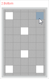
The editing of the grid follows when the hammer symbol is clicked. When the cursor is rolled over a segment, it is highlighted in blue. A click will place a ceiling light at the selected point. |
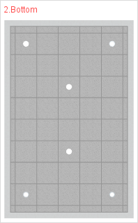
The Light Type can include Acrylic, Reflectors and Spots. Kicking on a segment that has already been given a light will remove that light. |
pCon.planner 6.5 has its own tool for displaying, storing and editing materials: the Material Editor. The button with this name is found on the Edit tab.
Toolbar
|
Create a new material. |
|
Remove the current material1. |
|
If the pipette is clicked onto an object in the design, its material will be selected in the Material Editor. The pipette is also used to grab colors from objects in the design and to convert them automatically into materials. |
|
Drop the selected material to an object. |
|
Assign material to selection. |
|
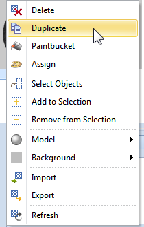
Duplicate the selected material. An example of the use of this function is to make a copy of a material which is read-only. |
|
Delete all materials not assigned to objects. There is also a global Purge function available. If materials that have not been assigned are to be kept, the local function in the Material Editor should not be used. With global Purge, you have the option of excluding certain materials from the deletion process (File > Purge). |
|
Call up the filter menu. The options are to show all materials, assigned materials only, unassigned materials only, read-only materials and the materials belonging to the objects which have just been selected in the Material Browser. It is also possible here to carry out a search for names of materials. |
Context Menu
|
A right click on a material in the Material Browser will open a context menu that provides further functions for the individual materials. |
|
|
Select the objects in the design which use the material selected in the Material Browser. |
|
|
Extend the selection in the design by those objects which are using the selected material. |
|
|
Deselect objects in the design which are using the selected material. |
|
|
Establish the rendering for previewing materials. |
|
|
Set the background for the previews in the Material Browser. |
|
|
Update the materials list in the Material Browser. |
|
|
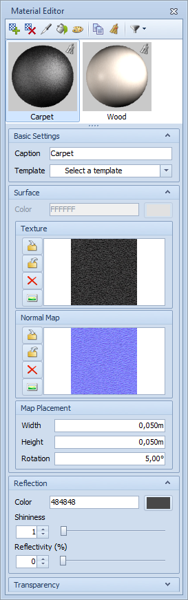
After clicking on the button to create a new material, a name can be selected in the Basic Settings and can be edited as desired using one of the integrated templates. Among others, there are templates for fabric, glass, self-illuminating material or metal. As soon as a new material has been created, a preview of that material will appear in the Material Browser2. In the next step, a decision can be made in the Surface window whether the material is based on a Color or a Texture. Normal Maps can be associated with both colors and textures. These simulate such textured structures as wallpaper, tiles or plaster and give the material a realistic effect. The buttons next to the previews of the Texture and of the Normal Map enable you to Import, Export, Delete and Display the relevant graphics. The Map Placement box serves to scale the material and set its rotation. To make a material reflective, the amount of reflection is set in the Reflectivity box. The further the slide control is pushed to the right, the more reflective the material will be. The shininess slider enables you to establish the intensity of the sheen on a material. It is also possible to establish a Color besides the reflectivity and the shininess. This will apply to the color of the highlight and to the color of the reflection. If no texture has been used for a material, it is possible to set the Transparency using the appropriate slide control, to decide how transparent the material is to be. If glass is used as the template for the material, not only the Transparency dialog will appear, but also an entry for Refraction index. This decides the degree to which light passing through a particular medium is refracted. A refraction index of 1 means that the light is not at all refracted and is the lowest value on the scale. If a template for a self-illuminating material is selected, settings are possible in the windows for Color of Light, Luminance and Transparency. |
Automatic Updates
Whenever the properties of a material are adapted in the Material Editor, these changes will be applied immediately to all objects that have been assigned that material in the design. It is thus not necessary to go through an additional procedure to assign the altered materials.
Drag & Drop
The materials in the Material Browser can be dragged and dropped (exported) into any directories in the Windows filing system. It is thus possible, for example, to place them on the desktop by a simple drag and drop action. This possibility is also available when using the Media Browser (see below). Just as they can be exported, materials can also, of course, be imported using Drag & Drop. The materials are simply dragged from the Media Browser or the filing system into the Material Browser.
The Media Browser in pCon.planner 6.5 is an innovation: a new, easy way of managing media. It is based on the principles behind Windows Explorer and is a tool that provides an interface between the pCon.planner design application and the directory structure of the operating system. This enables the user to work on his or her local hard drive, network drive, online storage etc, and to create a personal filing structure.
The Media Browser is opened by clicking on the Media Browser (the button is on the Presentation tab) and can, as is the case with any dialog, be docked or left floating.
Layout of the Media Browser
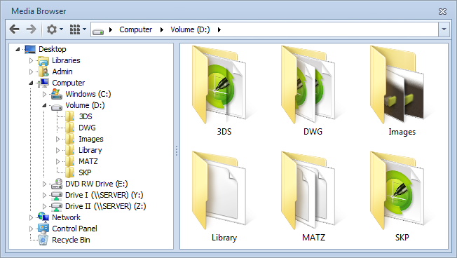
In the upper area, the Media Browser has two control arrows that enable the user to go back and forth between the selected directories. There is also a cog wheel alongside, which conceals such commands as Delete, Rename and conversion from image to video. On the right of this, there is the means of setting the size of the symbols for files and directories in the right-hand content window. The icon size can also be modified by pressing Ctrl and at the same time turning the scroll wheel while on the right-hand window. The navigation bar with a white background in the upper area (showing path details) indicates in which directory work is currently being undertaken. Below the Media Browser tool bar, there are two windows: the left-hand one is for navigating around the directory structure and the right-hand one is for the detailed content of directories.
Speedy Drag & Drop
All formats supported in pCon.planner 6.5, if they have been opened and imported, are displayed in the Media Browser and can be taken into and out of the filing system with the help of Drag & Drop. Supported formats include DWG, MATZ, SKP, 3DS, DWT and PNG.
The possibility of moving different types of files back and forth makes the creation of libraries for rendering, material and geometry quick and easy. The library content can then be used in new designs.
Images
The images rendered with the Media Maker are displayed in an image output window once the computation process is complete. There, they can be moved with the mouse after they have been selected with a click (see next screenshot). This mechanism can also be employed for serial pictures produced during the computation process for animations.
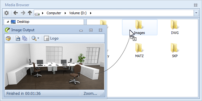
Besides using Drag & Drop, it is possible to use the Copy Image button (on the Home tab) to create an image of the active projection. Then a click on the cog wheel and selection of the Media Browser item Insert from Clipboard will save that image.
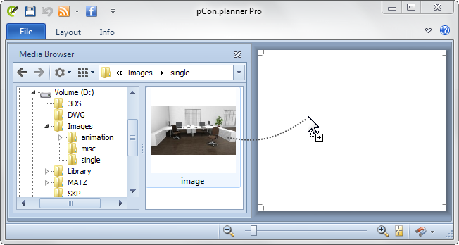
When dragging images from the Media Browser into the design, there are two options available for image processing purposes. If an image is dragged directly onto an object, it will be assigned as a texture. For an image to be treated as a separate object, it must be moved into an empty area of the design. When the mouse is released, the cursor will change appearance and then the image can be moved around as such.
It is also possible to insert images using Drag & Drop in the Layout area, and it does not matter whether this is from the Media Browser or the image output that appears after the rendering process.
Geometries and Materials
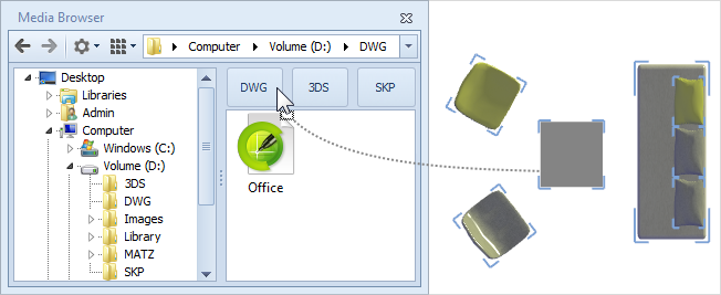
Individual objects, and also grouped objects, can be dragged and dropped into the Media Browser. As the screenshot shows, there are drop zones shown for this in the right-hand content window. The user can choose the format in which the selection made is to be stored. For this, the mouse is simply moved onto one of the three fields (DWG, SKP, 3DS) and released. The selection will then be saved automatically in the desired format. If none of the drop zones is used, the selected object will be saved in DWG format.
Converting individual images to video
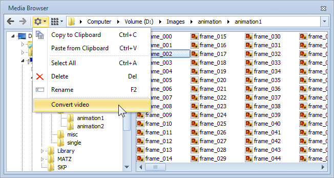
For creating a video from the individual images of an animation, there are two options to take. The first is the familiar image output dialog and the use of the Save as... function found there. The second is to use the Media Browser to convert the individual pictures: this can also be done retrospectively. Mark either the directory in which the individual images are stored or an individual image from the series and then call up the entry Convert Video (see screenshot).
In pCon.planner 6.5, there is a new concept underlying the creation and editing of animations. Animation paths can now, in contrast to previously, be drawn and altered interactively. There is a dynamic tab, specific to animations, to be opened when required and it unites all the functions for creating, editing and playback. The tab is opened by clicking the Edit button on the Presentation tab.
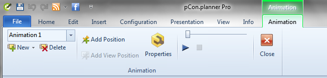
It will not be possible to select and edit objects in the design when the animation tab is open. This means that the user can concentrate fully on the creation of the animation path and avoid accidental unwanted operations.
Animation View
The Animation view which can be used once the animation tab has been opened enables the user to monitor each step of the work and its effect on the position settings already made. In the desired viewport, change over to Animation View as the projection. If a number of viewports are being used at once and if one of them is the Perspective projection, that one will be the viewport assigned automatically to Animation View when the animation tab is started.
Creation of animations
Animations are created in pCon.planner 6.5 using positions which are edited interactively and each position is linked to the others via a path. There are basically two options. One is circular animation in which positions are automatically generated; the other is animations which are manually and individually created. No matter which of the options is used, it is possible to adopt any current viewing or camera angles as a position within the animation. For this, change over to any of the perspective projections and click on Add View Position. This will create a new position and add it to the animation path.
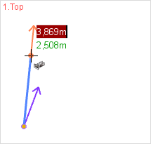
Creation of circular animations
On the left of the animation tab there is a button – New > Create Circular Animation – from which this function can be carried out. Select the entry and then use two mouse clicks to produce a circular animation around a certain point. Here again, as in the case of interactive animations, the position can be altered afterwards or new positions can be added and deleted; also the lines of sight can be modified. |
|
Creation of Animation Paths
What follows is a demonstration of creating and editing an animation path in Top perspective. The procedure starts with a click on the Add Position button.
|
|
|
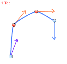
The first click establishes the start position for the path. |
The second click establishes the line of sight in relation to the position set in the first step. |
The procedure continues immediately with the setting of the next position. |
|
|
|
The line of sight is set for this newly established position as in the second step. The procedure will continue until canceled by the user (using ESC or context menu). |
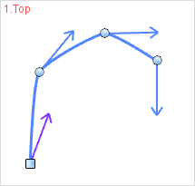
The path here created comprises four positions. The start position is symbolized by a square icon and the others with round ones. |
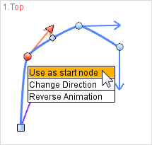
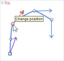
To alter the start position of the animation, the appropriate square icon is first selected. Then the Use as start node item is selected from the context menu. |
|
|
|
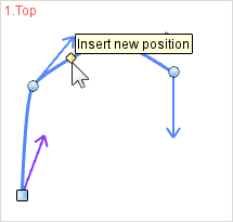
It is possible to insert new positions between existing ones. |
If a position has been selected, its position and line of sight can be modified with the aid of the red interactor. |
By selecting any particular number of positions and using New > Duplicate, a separate animation can be created. |
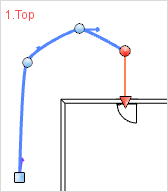
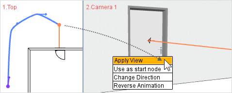
Updating Positions
|
|
The position for which the view is to be updated is selected. |
The mouse is moved into another viewport and there the desired projection or camera is established. A right click of the mouse will open the context menu. Selecting the Apply View item has the effect of assigning the current view to the particular position. |
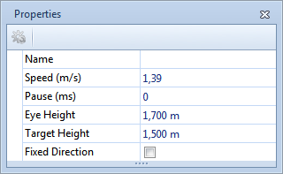
Editing Properties
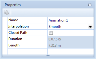
Other properties of the positions are governed by the Property Editor. The properties that can be set when one ore more nodes have been selected are Eye Height and Target Height (in relation to the line of view), Speed and Pause – plus the optional property of Fixed Direction. If none of the positions have been selected, the features for the entire animation are set in the Property Editor. Among the options are the name-giving, the Closed Path feature and Interpolation for the path.
|
|
When one or more positions have been selected, various properties can be modified. If Fixed Direction is set for a node, the line of sight will be maintained during movement to the next position and only altered when it is reached. |
If no position has been selected, the properties of the animation as a whole will be displayed. The Interpolation type serves to describe how the path between individual nodes is to be configured. The Closed Path option serves to make a connection between the last node and the start position of the animation, if it is activated.
|
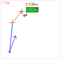
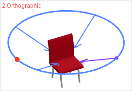
Playback of animations
The playback functions for animations are on the right of the animation tab. There is start and stop, and the possibility of clicking and dragging to fast-forward or rewind the animation using the slide control. Playback of an animation can be seen from various projection modes. In all 2D views, it will be visualised by a movement of a red dot (see graphic on right). |
|
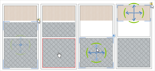
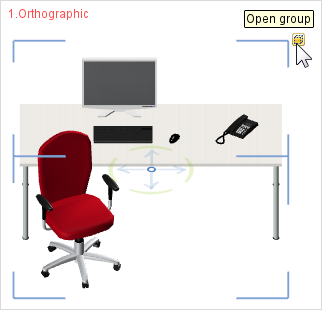
It did not use to be possible to edit grouped objects without first ungrouping them, but pCon.planner 6.5 has now made it possible – at least to mark an object within a group and to edit it to a certain extent without the need to detach it from its group. A special icon has now been provided in order to improve the visualisation of groups once they are selected. 
Selecting objects within groups
There are two different ways of selecting objects which have previously been included in a group. First the group is selected (its extent will be indicated by the new symbol – see above) and opened. After that, every object in the group can be selected for its own sake by mouse click or from the frame of the marked area (see illustration on the right below). If yet more groups are nested in a group, these, too, can be opened and the individual objects they contain can be selected.
|
|
When a group has been selected its own icon will appear close to the blue frame and can be used to open and close the group. |
Groups that have been opened are given a perforated grey line as a frame to show the selection. The objects within the group have the usual frame round the marked area. |
The second way of selecting and object within a group is to double click on one of the object’s surfaces or edges. If you do this, the group will automatically be opened in the background. In the case of nested groups, the whole group belonging to the object is opened with the first double click and a further double click goes one layer deeper.
Editing objects within groups
The following are the editing options for objects in groups:
•Moving, Rotating, Scaling
•Inserting objects and OFML articles into the group
•Configuring articles (modifying or transferring properties, etc.)
•Creating genuine copies (also a quick copy)
•Inserting objects which belong to the group and have been copied – the insertion can be into or outside the group
•Saving selections (also by dragging and dropping into the Media Browser)
•Deleting
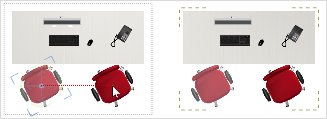
Combination with reference copies
Edits of objects within groups can also be combined with the reference copies which are familiar from pCon.planner PRO. The combination of the two mechanisms significantly improves efficiency, particularly for major designs which contain a large number of reference configurations. A good example is the new positioning of objects (see illustration below).
|
In pCon.planner 6.5 you can link the principles of reference copies with those of grouped but editable objects. Moving the chair contained in the group in the left hand frame causes the chair in the right-hand frame to be moved automatically. |
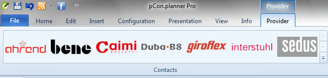
The list of providers, a dynamic tab which is enabled when OFML articles or objects from pCon.catalog are selected, is there to show the user the source (i.e. manufacturer) of the objects being included in the design3. Clicking on the relevant provider’s logo reveals the contact details and the option of using a contact form to email the company.
The following screenshot shows a sample assembly of logos that have become visible on selection of objects for the design. For each new selection of objects, the list of providers is updated automatically.
|
When an object (an OFML article or something from pCon.catalog) is selected, the Provider tab is enabled. Clicking on the items it shows will reveal information about the relevant provider. |
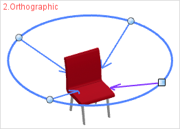
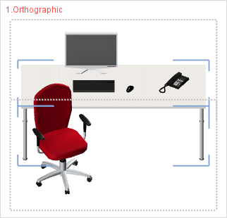
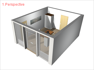
Unconstrained Orthographic Projection
Up to now, it has only been possible to use Perspective projection to set an individual viewpoint with the aid of Orbit Mode. Using Orbit Mode in one of the parallel projections, it used to be impossible to move around freely, such as Top, Front and ISO views.
Now, however, a new projection – Orthographic – has been introduced with pCon.planner version 6.5 and in the Orthographic projection one can use Orbit Mode. As is the case with orthographic projection in general, all vertical edges are represented as vertical and all edges that are parallel to each other are rendered as parallel. This removes the distortion which is typical of Perspective as a view. The two following illustrations give an indication of the difference between the two ways of rendering a view.
|
|
The unconstrained orthographic projection can also, just like Perspective projection, be used to zoom onto selected objects (see Camera group in the View tab).
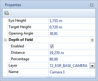
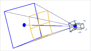
In photography, the term "depth of field” is used to describe the clarity of focus in a specific area of the image. This means that certain objects will be clear in the photograph, but what is in front of or behind them will be out of focus. Depth of Field is settable as an option for every camera in pCon.planner 6.5. If this option is disabled, as is the default case, all areas in the image computed photo-realistically will be rendered in focus. In this case the depth of field will be 100%. If the option is enabled, it is possible to set the depth of field either by entering a distance or using the interactive tool. The latter is done by selecting the right geometry for the camera by moving the yellow rectangle (see graphic on right). After this, a percentage value is set in the Property Editor to decide how clear the image should be (the standard value is roughly 80%). The higher the value, the clearer the picture and the lower, the fuzzier. |
|
|
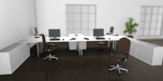
Here it is clear to see that only the chair in the foreground on the right is meant to be exactly in focus. All the objects in the background are fuzzy. It is possible to use the Distance and Percentage properties to adapt the area in focus, either enlarging or reducing it. The depth of field used in this instance, as a percentage, was 80%. |
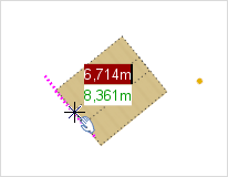
Guiding Lines and Guiding Points
The guiding lines and points introduced with pCon.planner 6.5 are tools to help with positioning and aligning objects. They will be automatically available for all operations (such as drawing, moving or rotating) and will take account of every rotation in the UCS (user coordinates system). Moving the cursor onto the edge of an object or onto a point, such as a corner, and holding it still for a moment will produce a temporary guiding line or point which is visible to the user.
Setting a shared intersection
|
|
|
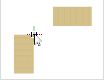
If the cursor is held on a point – in the instance shown it is on the corner of the table – a green and red dotted pair of axes will appear shortly afterwards. The point visualized in this way will be stored as a guiding point. |
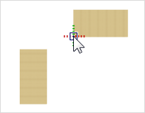
In the second step the cursor is placed on the next point (see corner of upper table). Here again, the green and red pair of dotted axes will become visible after a short time and the second guiding point will be stored. |
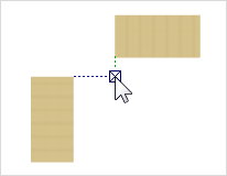
If the cursor is now moved in the direction of the shared intersection, it will be displayed. With this point, for example in the UCS, you can position both tables at an equal distance from the shared intersection. |
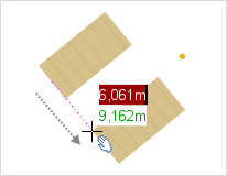
Setting a guiding line
As demonstrated in the following example, guiding lines can be set so that objects can be dragged along them.
|
|
|
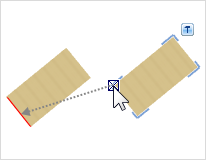
If the table on the right is to be moved along the edge of the table on the left, which is marked in red, it must first be brought into position. |
If the cursor is moved over the edge of the left hand table and the mouse held still for a short time, a temporary guiding line will become visible. |
The table on which the cursor is can now be moved along this guiding line. |
Setting the center of a circle
To find the center of a circle, set the cursor somewhere on the circumference and hold it steady for a short time. The center will appear as a guiding point and will be saved as such. If the cursor is now moved towards it, the center will be visualized as a small box with diagonals. The circle could now, for example, be moved using its center point. |
|

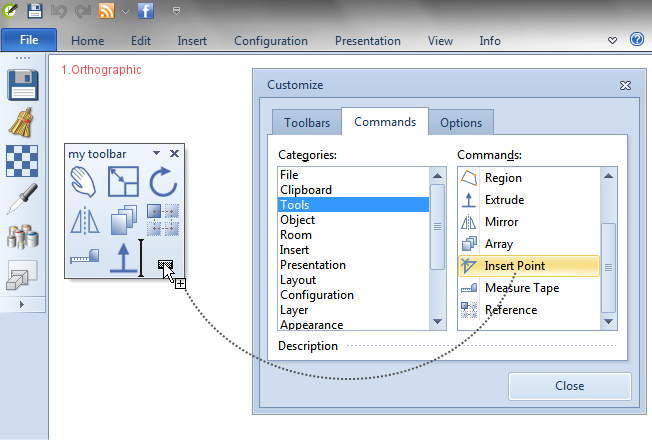
The Customize button in the Application Menu enables you to produce toolbars you can configure for yourself. If you frequently use certain functions or tools you can place them on one or more toolbars to suit yourself; you can also integrate them as floating or docked elements on your pCon.planner interface.
|
Allocating operations to a toolbar. In order to enlarge the available screen area, remember that it is possible to use the arrow symbol (near the help symbol, top right) to hide the ribbon. |
Footnotes
If a material has been deleted, it can be restored using the Undo function on the Quick Access Toolbar. (Back to the article) |
|
The previews being shown in the Material Browser are “Carpet" and “Wood”. (Back to the article) |
|
The logos assembled in the graphic are a random assortment and in no way intended to indicate a preference. (Back to the article) |